This is the first draft of my music video completed, I will be asking my friends and peers for feedback to see what improvements, if any, that they think I need to make to make it look like a professional music video.
Wednesday 26 February 2014
Thursday 20 February 2014
The Making Of My Music Video
This short video shows all the shots that have gone into the making of my music video since my first draft including titles of the features that have been used and incorporated into the filming and editing.
Friday 7 February 2014
Digipak Advertisement

For my magazine ad I have taken the background of my overall digipak and place it as a background layer for the poster. On top of that I have placed a cosmo effect, thats seen on the cd cover and then a manipulated image of my artist relating to a cosmo effect. The reason in which I have done this is to form continuity amongst all of my media texts to show a cleary link between the various forms. I have then placed text on to the image, the same font as seen on my album cover, again to show the link between the advert and what it is promoting. At the top of the poster is the album title, each character arranged differently and in a different size to represent a travel sense of feel. Below that is the artists name, a bit smaller than the overall title as the image is also there to indicate who the artist is and the purpose of the ad is to sell the album not the artist. Then finally below that is information about what the advertisement is all about. The album release and the date, the date being one that would be very familiar to the audience of Kid Cudi (4/20). Underneath that is some further information of a performance by Kid Cudi Live at The O2 Acadamy to really lure in the audience. Overall the advert gives an intergalactic cosmo theme which clearly links with the house style and theme of my digipak and music video.
Thursday 6 February 2014
Ad Composition Draft Ideas
.jpg)
.jpg)
.jpg)


Here are possible ideas for my magazine advert layout that I have created with the conventions in mind from current existing media texts with the same aims and advertising purpose. First I drew ideas out by hand to know what each selesction of text was going to say and then I worked digitally on adobe photoshop to see the ideas with my chosen font and more specific sizing.
Wednesday 5 February 2014
Magazine Ads


You can see here a clear link between the advertisement for The Vines and their cd product. Continuity of the green graphic design of leaves and twirls is the iconic feature seen in these two designs that clearly shows that these two media texts are related. As well as this you can see the text used is also the same, again bringing continuity and formal simple and easy recognition for the band and their work.
______________________________________________________________


Here again you can see the album cover is almost identical to the magazine advert the only thing missing is the text at the bottom of the ad that turns the media text from an album form into an advert. When you see how many similarites are shared between the album cover and the advert you feel as though it almost lacks creativity but the purpose is to show a clear link between the products to make it easy for the audience to recognise the album as soon as they go to buy it in a shop from what they have seen on the advert and this forms conventions.
_______________________________________________________________


Finally another almost identical combined design that looks like it has just been simply stretched at the bottom to form the advert for the music album. This all confirms that the relation between album cover and magazine advert is to be almost identical to fit the expected conventions between these media products.
____________________________________________________________
As you can see these magazine adverts don't contain a clear image of the artists they're advertising, the main focal point is on the texts presenting the album name. The posters are there to gain your attention and persuade you into buying the album which they make clear by simple bold fonts. The ad is to advertise the album not the artist in terms of selling so you are not presented with a glossy image of the artist but an image that is there to represent the album and the meanings behind potential songs that the album contains and represents. I have also found images of the album it is advertising to show the similarities that have purposly been put in place of the advert to link it to the product. The conventions of an album ad, is an artist name title, album sub title and the release date. Those are the main conventions some advertisements of which add more information such as upcoming concerts or gigs usually seen in a smaller font. Sometimes the rolls of title and subtitles change for example the artist name may be the main title on one ad but then the sub title on the other. It all depends on which one the artist and their publishers think is the most important and the purpose of the ad.
Tuesday 4 February 2014
Digipak Layout Complete

Here is my complete digipak, although I made the pack in the form of a cd so I could create it physically using a real cd case, here I have created the digipak version for the cd and dvd option of my product to fit the brief of my overall project. The theme contains continuity having a galactic theme throughout that is not only presented in my digipak but my music video and magazine advert too. The colour scheme and chosen font all also remain the same throughout too, as well as on the cd and dvd them selves to link all contents together as one. The colour scheme on the cd and dvd are slightly different to differentiate the two products but the design is the same to show they come together in the digipak. The image on the inside left page is the same as what is seen on my magazine ad to link together the product with the magazine advertisement as this was a running convention seen with media products and texts of this kind. When researching magazine ads I noticed that the advertisement designs were almost identical to the cd cover they were advertising but as my product is a digipak I have incorporated the image as one of the pages insteaad of the cover as there is more too the product that a simple front back and content design. Finally to stick with all the continuity aspects I found throughout my reserarch, the image on the bottom left matches with a shot seen in the music video itself which creates one big connection between the different forms of media I have created for my products. The links in my work are to show that the media texts are all connected and easily show that they belong to the same artist, Kid Cudi.
Album on iTunes

This is how my music video appears on iTunes amongst artists of the same genre as well as others. The reason I have shown this is to show the different ways in which music can be absorbed these days, not only physically like my brief has asked me to make but also digitally too due to p2p sharing making it possible for music to spread quickly and on a larger scale. iTunes presents my product showing the front of the album cover with the album title and artist name below, the same sort of view that you would see of the physical product when going to buy it in a shop, either a music store or a supermarket.
Complete Digipak In CD Case Form


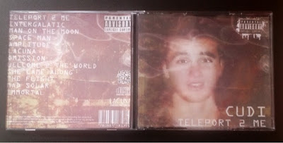

This is my product so far in the form of a cd. I have created this as a draft for my digipak to see what my design looks like so far physically in the order of a professional cd casing. I wanted to see if the album looked realistic and if it would pass as being an actual artists artwork available in a shop so I showed my product to some friends and family and asked them what they thought.
"It definitly looks realistic, its got all the logos that you see on real life cds as well as a music record logo, barcode and parental advisory logo" - Paige Rodmell
"I didnt realise it wasnt a real album at first, the back is definitly the most believable with the label information writing and all the logos" - Rachel Widdicks
" I wouldnt of known it wasnt real if you hadnt of told me, its really good" - Sharon Graham
"I like the writing around the edge of the cd as well as on the back, it gives it a professional finish that is very believable" - Katie Craven
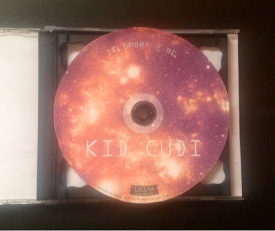
Final CD

For my CD design I have stuck with the cosmic theme to bring continuity to the whole digipak. I have included the artists name in a large font, the same text as seen on the front, back and spine of the cd and what I plan to place on my advert too. The album title can be seen at the top of the cd with the record label and address at the bottom. Around the end of the cd is the licensing and laws for which this cd holds in terms of copyright and a brief description of what may take place if these laws are broken as this is what is seen on all cd's that I have looked at in my research and that I have ever come across when buying cds for my own personal use.

On the Left is the CD that contains the mp3 music created by my artist in my artists digipak and on the right is the DVD form. The designs of the overall disks are almost identical to identify the link between the two products that belong to one artist and one digipak. To tell the two forms apart there is a change in the design colour to indicate the two different forms that belong in the digipak on being mp3 and the other being mp4.
Monday 3 February 2014
CD Compositions


Here are four layout ideas for my possible cd design. Each cd will have a main image covering the full cd that will match with the design of my other media products to form contiuity and then I have placed text in possible postitions too to see what different variations I could have.
Sunday 2 February 2014

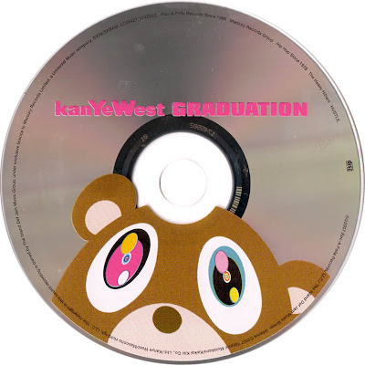
Here are three cds that I have looked at to gain an idea of the conventions that are expected to be seen on an artists cd. Looking at various cds I have realised that the conventions used are mainly decided by the individual themselves and the approach they simply wish to take. I have seen cd's with nothing but a simple design, no text just a graphical image, but then I have seen ones covered in information with only a basic graphic design, similar to the ones I am going to go on to explain. A great way to present the contrasting individual styles that are created by the artists to form these conventions is to show the variation in the conventions used by one artist to show how the designs and the conventions included change from album to album within just one artists artwork.

.jpeg)
Above are two albums by Beyonce, one that contains a lot of information such as the artists name, album title, song titles, copyright laws and production/record label logos as well as a background design, another more recent album that contains clearly only her name and very dark production and record label logos. Gaining an idea for the conventions of a cd or even a digipak may seem very difficult at first as an example like this shows just how different the artwork can be for one artist never mind all the various genres and pinpointing the expected features may seem confusing due to these variations. It all looks very neat and professional but I want to achieve something in between these examples I have just given to show the differences between the many approaches that can be take to achieve a successful cd design and how the conventions can be varied to achieve unique products. The Kid Cudi and Kanye West styles above are a good example of what I am aiming for, they contain everything you need to know and still present a strong and successful professional finish. They show copyright laws around the end and then album title and artist name in the centre along with a eye catching background design which is what I imagined to be seen on a cd before I began my research. The Kid Cudi cd at the top is seen along side the case that it comes in and you can see a clear link between the two which shows this design has been a success to this product.
Above are two albums by Beyonce, one that contains a lot of information such as the artists name, album title, song titles, copyright laws and production/record label logos as well as a background design, another more recent album that contains clearly only her name and very dark production and record label logos. Gaining an idea for the conventions of a cd or even a digipak may seem very difficult at first as an example like this shows just how different the artwork can be for one artist never mind all the various genres and pinpointing the expected features may seem confusing due to these variations. It all looks very neat and professional but I want to achieve something in between these examples I have just given to show the differences between the many approaches that can be take to achieve a successful cd design and how the conventions can be varied to achieve unique products. The Kid Cudi and Kanye West styles above are a good example of what I am aiming for, they contain everything you need to know and still present a strong and successful professional finish. They show copyright laws around the end and then album title and artist name in the centre along with a eye catching background design which is what I imagined to be seen on a cd before I began my research. The Kid Cudi cd at the top is seen along side the case that it comes in and you can see a clear link between the two which shows this design has been a success to this product.
Subscribe to:
Posts (Atom)