____________________________
For this years media project I have created a Music Video Promo, a digipak and a magazine advert in support of its release. To create an effective combination between my main product and ancillary text I constantly aimed to keeping continuity between all three, remaining with the same theme throughout and an abstract style. After my teacher watched mymusic video she gave me some spoken feedback that quotes:
Rebecca Ives - "There is not a lot to change in your music video as it is abstract and really works well. I really like the light aspect which I would incorporate a bit more on the scene were you are show the males hands. The mirror effect of the female is really nice and the graphic image at the start is really interesting too, relating well to the galactic theme of the video. At the end of the video were you are shown the candle being blown out I would incorporate the image again to incorporate the galaxy aspect again to finalise the piece. Overall it is very good and with those small additions it will finalise to be a very nice piece." - Her feedback instantly shows the effectiveness of my video as I wanted it to achieve an abstract style which she confirms I have done straight away. She also confirms how I have related well to my galactiv theme that aim out to incorporate by using a galactic style image make from fireworks on Adobe Photoshop CS6. The image is also seen within my ancillary texts showing how my products all link together.
I shared elements such as the same font throughout my ancillary products, that being 'OCR A Std' created on Adobe Photoshop. By keeping the font the same it indicates a clear link between the two showing that they are combined products although of different forms. The only time there was a change seen within the font aspect was when I changed the size to differentiate the different importance's of each conventional piece of text as well as reducing the opacity of some letters or numbers. This also helped to form a structure within my house styles making my products look more appealing and professional.

Another shared element across all three of my products is the galactic sci-fi theme, there to reinforce the song title 'Teleport 2 Me'. Teleportation is not something achievable in this day and age and is stereotyped to be travel through time with indications of space. I Have included one main image across all my products that I created on Photoshop using images of fireworks layered on top of each other. The image represents a nebula giving off a very galactic sense of feel which links directly with the expectations of teleporting. This image can be seen at the beginning and end of my music video as well as a low opacity layer on my advert design, digipak front cover and also placed as a full image on one of the pages in my digipak. This helps to combine all my three products in a clear and effective way forming a theme that reinforces the song title of the main product. The colours found in the image also makes up the colour scheme for both of my ancillary texts that being a mixture of purples, black, shades of orange, yellow white and gold. I chose this colour combination as it highly reflects the sky on a night which links straight to space. It is also the colours you see when flying above countries on a night and you can see all the lights from the buildings below, this relates to the teleportation.

My chosen font is white as it contrasts against the other main colours that form the backgrounds for my pieces. It connotes innocence and progression, indicating my artists journey through his career and also a reference to the song. It is as well known as being the favorable colour for wedding dresses in America reinforcing the relationship shared between the American artist Cudi and his girlfriend, the whole meaning and point of the song. Finally it also represents the stars that appear white in the night sky that stand out against the contrasting darkness which is what I want the text to do to inform my audience of what they are being presented.
L - 'Kid Cudi' this informs the audience of who the artist is that created the work on both the advert and the digipak. In a large white and clear font it will stand out against the contrasting dark backgrounds of my products to help lure in my audience, both music purchasers in store and magazine readers. The Song title which also shares same elements of promotion, shares the same font style to maintain continuity throughout my products.
I - The digipak is by the artist Kid Cudi who is owned, for my products, by Lacuna Records - "Lacuna: an unfilled space; a gap" - with this definition I decided that the missing gap of 'Lacuna Records' would be filled by each individual artist that is a part of the label so the meaning behind the names works very well. 'The music artist.. filled a Lacuna in the music industry'.
I - The digipak advertised through my ad is representing and advertising Kid Cudi's music. The ad helps to sell his music and the cd actually delivers his music, therfor they represent the values and ideas that my artist has towards the music industry for the consumption of his target audience.
A - My target audience is aged between 16-29 both male and female and who are interested in the urban culture of today. My video contains a fun vibe presented with flashing lights, lots of colour and a love story aiming at the younger end of the scale. Oppositely, there are scenes of smoke to indicate Cudi's habit so for legal reasons I couldnt aim lower as this would convey the wrong message as any younger the audience are believed to not be mature enough for this content by law but I can aim older and that also links with the audience conventions for my genre.
R - The design of all my products in terms of the themes throughout represent Cudi as being fun, creative and very relaxed through the use of colours, smoke and varied effects. There is change between coloured shots and also black and white representing emotions, separation and past and present time.
Making of Ancillary texts
_______________________________
Making my digipak, I began by designing different house styles on paper and then moved on to digital designs where I could practice with the exact fonts that I wanted to use.


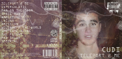
Next I made the front cover on Adobe Photoshop Cs6, combining layers of images that I had captured. From this I chose my colour scheme matching an image that I incorporated into my music video as a base to form my galactic theme from. I included a picture of my artist as this is conventionally expected so that the audience can instantly see who the album belongs too without reading any text. I manipulated my image to combine effectively with the galactic design I had created. I removed the background of the image so that the design i had created showed through much more clearly. To do this i selected what i want to erased with the selection tool and then removed it with the eraser. Then I added a smoke effect which Links the digipak to my music video as there are shots of smoke which all relates to the ideology of the artist. I had already chosen what font I wanted to use (OCR A Std) from practice fonts earlier on in the project so next I added that conventionally, including all the features I had found that were expected to be seen on my digipak from gathering research of existing products.

Once I was happy on the design I then began designing the spine using the same colour scheme text and background to form continuity and effectively combine the sections which is conventional for this form of product. i placed it on the right side of the front cover as when the product is formed and each section is folded this will be on the edge of the pack. The reason for the spine being on the edge is so when the disk is stacked to sell in stores you can still identify the product although you cannot see the cover. Then I created the back of the digipak were again the design matched the rest I had already created. I added the song titles in an order I had decided on from creating drawn and digital templates in relation to existing products and added logos that I had seen on products belonging to my genre too.

These logos consisted of a parental advisory logo, the same as which had been designed onto the front of my album as the content of my album was not suitable for some ages. I chose to do this as my genre is known for explicit music lyrics meaning the audience has to be informed in a clear way so young children are unable to purchase it without parental consent. Other logos included my music record label logo, disc, a QR Code and a barcode. I included these by copying them off of the internet (google) and inserted it with a 'darken' effect so that the background disappeared leaving only the barcode itself and not a square box around it making it look more professional. I then inverted them to make them all white as I could only find black logos on google and that didnt match with the rest of my design. By inverting them they then effectively matched with the rest of my textual colour scheme. As each section of the digipak was starting to come together I then took the digipak template and opened it in Adobe photoshop Cs6. With that I placed on the sections I had created to see what I had left to create.
Before I started on the next sections I printed out my cd to see what it looked like so far as a finished product in terms of a CD and not yet a digipak. I asked family and friends who commented saying:
"It definitly looks realistic, its got all the logos that you see on real life cds as well as a music record logo, barcode and parental advisory logo" - Paige Rodmell
"I didnt realise it wasnt a real album at first, the back is definitly the most believable with the label information writing and all the logos" - Rachel Widdicks
" I wouldnt of known it wasnt real if you hadnt of told me, its really good" - Sharon Graham
"I like the writing around the edge of the cd as well as on the back, it gives it a professional finish that is very believable" - Katie Craven
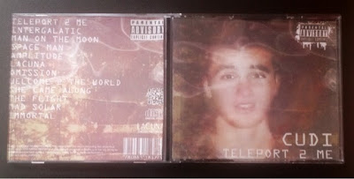
Placing it onto the digipak template was when I had to make some adjustments, As I had created the front cover, spine and backcover not with a template some of the sizing wasnt accurate. The only thing i needed to do the was crop the designs down to fit and place them inside the template. I then added the image I had use as a layer effect for my overall design, that is also seen in my music video, and placed it into my chosen section of the template. For it to fit I again had to crop it down as the image was a landscape scale and i needed it to be square. Then I moved on to designing my CD taking the image i just discussed and selected a circle section within it that will be the shape of the CD. I then selected the inverse selection and deleted all of the image except the selected circle. I then selected a smaller circle in the centre of the disk that would be the central hole in my final product. i next changed the colour balance to achieve two different versions of the image that would form my disk designs. I did them different colours to help differentiate the purpose of the two disks but kept the design the same to effectively combine them within my product. I added the conventional expectations of the artist name, song title, record label logo and prosecution laws around the edge of the disks using the same font and designs as those seen on the outer packaging. To achieve the curved effect for my font I had to create a path on photoshop and choose a curve angle that i wanted it to rotate at to fit nicely with the design. This was something I found tricky at first as I had never achieved the effect using a path but as the disk is one full circle the text could not be adjusted simply by the transform buttons in terms of an arch edit.

To place the final disk designs on to my template i rotated them 180 degrees so that they was upside down on the screen but the right way for when they were to be printed and the pack was to be folded to form the product. Before completing my final section of the digipak I decided that this would be my magazine ad, as conventionally the magazine ad that advertises the album form is almost identical to that of the front cover design and as a digipak the ad design features in the pack.
Moving on to my advert that I have created on Adobe Photoshope cs6 I combined layers for the design similarly to the way I created them for my digipak. I took the background of my overall digipak and placed it as a background layer for the poster. On top of that I have placed a cosmo effect thats seen on the cd cover too and then a manipulated image of my artist relating to a cosmo effect known on photoshop as 'Glowing Edges'. The reason in which I have done this is to form continuity among all of my media texts to show a clear link between the various forms. I then placed text on to the image, the same font as seen on my digipak design, again to show an effective combination between the advert and what it is promoting. At the top of the poster is the album title, each character arranged differently and in a different size to represent a travel sense of feel. I did this by creating each letter separately and transforming the text one at a time varying the size. Below that is the artists name, a bit smaller than the overall title as the image is also there to indicate who the artist is and the purpose of the ad is to sell the album not the artist. Then finally below that is information about what the advertisement is all about. The album release and the date, the date being one that would be very familiar to the audience of Kid Cudi (4/20). Underneath that is some further information of a performance by Kid Cudi Live at The O2 Acadamy to really lure in the audience all remaining written in the same font just varying in size due to importance. Overall the advert gives an intergalactic cosmo theme which clearly links with the house style and theme of my digipak and music video.

L - The title 'Teleport 2 Me' tells the audience the name of the product that the ad is advertising. i chose to put it in the same larger white and clear font as seen on my main products to show and effective combination of conventions with my media products. The White against the dark purple background design clearly stands out for my audience to see also reinforcing the idea of starts at night in a galactic scenery, not only my chosen theme but also a reinforcement of the song title and representations.
I - I think this advert would be published in Music magazines that aim in particular to artists from my chosen genre such as VIBE and COMPLEX. My design style is similar to the way artists belonging to that genre present their and those are the type you see in the magazines I have just mentioned. Also another reason that those magazines are most likely to feature my ad is that Kid Cudi is always a main feature for those companies so anything to do with a new release or concert date will immediately be included in their products. Online research at 'wiki.answers' suggests it would cost $9000.00 to have an ad in VIBE for one fourth of a page. For Complex magazine it quotes that for an ad in their magazine it costs "Too much.. Just stick with flyers. A normal Ad is about $6.500.00 per magazine. So I am unsure of which would be the cheapest from my research. Both these magazines aim at men and woman just like who I am aiming my products at so either of these companies products would be perfect to place my ad in.


I - This product aims to sell the digipak I have created of Kid Cudi. I used a release date that is iconic to the audience of Kid Cudi and that will persuade them more into buying the album as it could make them believe that it contains special features for this particular date.
A - The target audience for all my products are both male and female ageing between 16-29 due to the explicit content. They will be interested in urban culture and may of grown up listening to artists such as shaggy due to their parents influence and interest. They may also of gained their interest in the genre of Hip-Hop/Rap based on the environment they live in, their peers or particular hobbies or interests.

R - It represents Cudi as being individual and creative showing a reflection to his music and the videos that work along side it. it shows hes not afraid to stand out and be proud of who he is and what he creates.
After creating my magazine advert I then cropped it down on photoshop to form a square selection of the product that I then place onto the template of my digipak to show effective continuity between the different product forms. This is also conventional as previously mentioned for magazine ad designs to be almost identical to the design of the digipak content or CD front cover. I rotated it 180 so that just like the disk designs they are not the right formation of screen but they will be when the product is printed.

If i was to redo my products I think the only things I would change would be that i included a rating on my advert decided by the magazine that it would be place in but if I have don't that i think the advert could of been too busy and this would of challenged conventions and possibly making my product look unprofessional which would make it overall unsuccessful. The front cover image shot of my artist would be another change Id make as the more I look at it the more I dislike it. It could of certainly more posed but at the same time his expression does match that of those he shows in my music video, showing emotion and forming effective combinations once again.
Making of Ancillary texts
_______________________________
Making my digipak, I began by designing different house styles on paper and then moved on to digital designs where I could practice with the exact fonts that I wanted to use.

Once I was happy on the design I then began designing the spine using the same colour scheme text and background to form continuity and effectively combine the sections which is conventional for this form of product. i placed it on the right side of the front cover as when the product is formed and each section is folded this will be on the edge of the pack. The reason for the spine being on the edge is so when the disk is stacked to sell in stores you can still identify the product although you cannot see the cover. Then I created the back of the digipak were again the design matched the rest I had already created. I added the song titles in an order I had decided on from creating drawn and digital templates in relation to existing products and added logos that I had seen on products belonging to my genre too.
These logos consisted of a parental advisory logo, the same as which had been designed onto the front of my album as the content of my album was not suitable for some ages. I chose to do this as my genre is known for explicit music lyrics meaning the audience has to be informed in a clear way so young children are unable to purchase it without parental consent. Other logos included my music record label logo, disc, a QR Code and a barcode. I included these by copying them off of the internet (google) and inserted it with a 'darken' effect so that the background disappeared leaving only the barcode itself and not a square box around it making it look more professional. I then inverted them to make them all white as I could only find black logos on google and that didnt match with the rest of my design. By inverting them they then effectively matched with the rest of my textual colour scheme. As each section of the digipak was starting to come together I then took the digipak template and opened it in Adobe photoshop Cs6. With that I placed on the sections I had created to see what I had left to create.
Before I started on the next sections I printed out my cd to see what it looked like so far as a finished product in terms of a CD and not yet a digipak. I asked family and friends who commented saying:
"It definitly looks realistic, its got all the logos that you see on real life cds as well as a music record logo, barcode and parental advisory logo" - Paige Rodmell
"I didnt realise it wasnt a real album at first, the back is definitly the most believable with the label information writing and all the logos" - Rachel Widdicks
" I wouldnt of known it wasnt real if you hadnt of told me, its really good" - Sharon Graham
"I like the writing around the edge of the cd as well as on the back, it gives it a professional finish that is very believable" - Katie Craven
Placing it onto the digipak template was when I had to make some adjustments, As I had created the front cover, spine and backcover not with a template some of the sizing wasnt accurate. The only thing i needed to do the was crop the designs down to fit and place them inside the template. I then added the image I had use as a layer effect for my overall design, that is also seen in my music video, and placed it into my chosen section of the template. For it to fit I again had to crop it down as the image was a landscape scale and i needed it to be square. Then I moved on to designing my CD taking the image i just discussed and selected a circle section within it that will be the shape of the CD. I then selected the inverse selection and deleted all of the image except the selected circle. I then selected a smaller circle in the centre of the disk that would be the central hole in my final product. i next changed the colour balance to achieve two different versions of the image that would form my disk designs. I did them different colours to help differentiate the purpose of the two disks but kept the design the same to effectively combine them within my product. I added the conventional expectations of the artist name, song title, record label logo and prosecution laws around the edge of the disks using the same font and designs as those seen on the outer packaging. To achieve the curved effect for my font I had to create a path on photoshop and choose a curve angle that i wanted it to rotate at to fit nicely with the design. This was something I found tricky at first as I had never achieved the effect using a path but as the disk is one full circle the text could not be adjusted simply by the transform buttons in terms of an arch edit.
To place the final disk designs on to my template i rotated them 180 degrees so that they was upside down on the screen but the right way for when they were to be printed and the pack was to be folded to form the product. Before completing my final section of the digipak I decided that this would be my magazine ad, as conventionally the magazine ad that advertises the album form is almost identical to that of the front cover design and as a digipak the ad design features in the pack.
Moving on to my advert that I have created on Adobe Photoshope cs6 I combined layers for the design similarly to the way I created them for my digipak. I took the background of my overall digipak and placed it as a background layer for the poster. On top of that I have placed a cosmo effect thats seen on the cd cover too and then a manipulated image of my artist relating to a cosmo effect known on photoshop as 'Glowing Edges'. The reason in which I have done this is to form continuity among all of my media texts to show a clear link between the various forms. I then placed text on to the image, the same font as seen on my digipak design, again to show an effective combination between the advert and what it is promoting. At the top of the poster is the album title, each character arranged differently and in a different size to represent a travel sense of feel. I did this by creating each letter separately and transforming the text one at a time varying the size. Below that is the artists name, a bit smaller than the overall title as the image is also there to indicate who the artist is and the purpose of the ad is to sell the album not the artist. Then finally below that is information about what the advertisement is all about. The album release and the date, the date being one that would be very familiar to the audience of Kid Cudi (4/20). Underneath that is some further information of a performance by Kid Cudi Live at The O2 Acadamy to really lure in the audience all remaining written in the same font just varying in size due to importance. Overall the advert gives an intergalactic cosmo theme which clearly links with the house style and theme of my digipak and music video.
L - The title 'Teleport 2 Me' tells the audience the name of the product that the ad is advertising. i chose to put it in the same larger white and clear font as seen on my main products to show and effective combination of conventions with my media products. The White against the dark purple background design clearly stands out for my audience to see also reinforcing the idea of starts at night in a galactic scenery, not only my chosen theme but also a reinforcement of the song title and representations.
I - I think this advert would be published in Music magazines that aim in particular to artists from my chosen genre such as VIBE and COMPLEX. My design style is similar to the way artists belonging to that genre present their and those are the type you see in the magazines I have just mentioned. Also another reason that those magazines are most likely to feature my ad is that Kid Cudi is always a main feature for those companies so anything to do with a new release or concert date will immediately be included in their products. Online research at 'wiki.answers' suggests it would cost $9000.00 to have an ad in VIBE for one fourth of a page. For Complex magazine it quotes that for an ad in their magazine it costs "Too much.. Just stick with flyers. A normal Ad is about $6.500.00 per magazine. So I am unsure of which would be the cheapest from my research. Both these magazines aim at men and woman just like who I am aiming my products at so either of these companies products would be perfect to place my ad in.

I - This product aims to sell the digipak I have created of Kid Cudi. I used a release date that is iconic to the audience of Kid Cudi and that will persuade them more into buying the album as it could make them believe that it contains special features for this particular date.
A - The target audience for all my products are both male and female ageing between 16-29 due to the explicit content. They will be interested in urban culture and may of grown up listening to artists such as shaggy due to their parents influence and interest. They may also of gained their interest in the genre of Hip-Hop/Rap based on the environment they live in, their peers or particular hobbies or interests.
R - It represents Cudi as being individual and creative showing a reflection to his music and the videos that work along side it. it shows hes not afraid to stand out and be proud of who he is and what he creates.
After creating my magazine advert I then cropped it down on photoshop to form a square selection of the product that I then place onto the template of my digipak to show effective continuity between the different product forms. This is also conventional as previously mentioned for magazine ad designs to be almost identical to the design of the digipak content or CD front cover. I rotated it 180 so that just like the disk designs they are not the right formation of screen but they will be when the product is printed.
If i was to redo my products I think the only things I would change would be that i included a rating on my advert decided by the magazine that it would be place in but if I have don't that i think the advert could of been too busy and this would of challenged conventions and possibly making my product look unprofessional which would make it overall unsuccessful. The front cover image shot of my artist would be another change Id make as the more I look at it the more I dislike it. It could of certainly more posed but at the same time his expression does match that of those he shows in my music video, showing emotion and forming effective combinations once again.
No comments:
Post a Comment